Toying with CSS3 text-shadow
So I bought Andy Clarke’s “Hardboiled Web Design” lately and have been devouring and savouring it over the past week or so. I’ve only a chapter or two left, so once I’m done I’ll write a full review. So far, it is without doubt THE (pronounced ‘thee’) web design book du jour and a must read for everyone in the industry. Between Andy, Dan Cederholm over at Simple Bits and Chris Coyier on CSS Tricks*, I’ve been feeling the CSS3 love.
I was reading an article on swissmiss this evening which mentioned a font called Champion Gothic by Hoefler & Frere-Jones. I visited the site to have a look and in the carousel showcasing the font, there was an image that made me stop and have think. I’ve taken a screen shot here:
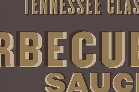
It reminded me of doing our Linocuts and Silkscreen prints years ago in school, so I wondered if, in using the latest and greatest CSS3 techniques, I could replicate this effect. So here’s a small demo of how I achieved it.
NB: I’m not, in ANY way, going to attempt to make this work on older browsers. If you’re not viewing this site in Chrome, Safari, Firefox or IE9, then sorry, it’s not going to work.
So to start, I need a simple HTML page to which I’ve added a section element with the text I want to display in a paragraph tag:
<section>
    <p>Slipscreen</p>
</section>
Nice and simple, not too much taxingness (I know. I made that word up). Next we need to apply the styles. First off, I wanted to choose a typeface, so I used one of Google’s freely available typefaces:
<link href='https://fonts.googleapis.com/css?family=Anton' rel='stylesheet'>
Anton’s a nice narrow form of impact sans-serif typeface. In all uppercase, it’s not quite the same as the Champion Gothic sample we saw earlier, but close enough for the purpose of this demonstration.
So we have our typeface and we have our markup, let’s start applying styles.
html {
    text-align: center;
    background: rgb(180,170,160);
}

body{
    margin: 0 auto;
    width: 960px;
}

section {
    margin: 50px;
    padding: 15px 50px 40px 50px;
    position: relative;
    width: 800px;
    height: 300px;
    background: rgb(83,70,70);
}
Ok, first things first. I always like to make sure that my html wrapper, coupled with the body tags, allow me to position my content nicely in the center of the page. People don’t always agree with me on this, but I like to do it. It’s like my safety blanket. But what, wait, what’s that? You didn’t know you can use the html tag in your style sheet?! Mais biensûr! It’s a block level element isn’t it? Of course you can. Also, fixing the width of the html and using the body tag as a center aligned column removes the necessity for all those nasty div’s with id’s like ‘wrapper’ and ‘container’. Yuck!
Our section tag is then created with a bit of a margin, a bit of padding, a bit of a height and width and a nice background colour. I always used to use hex colour-types, but since I discovered opacity settings, I much prefer using rgb values. They’re no easier nor difficult to use than hex values. I’m also lazy, which is why I use the ‘background’ style attribute as opposed to ‘background-color’. Imagine I added an image to that style, I’d have to go back and delete the text ‘-color’!!! Ugh, so much hassle.
Anywho, moving on. Now that we have our structure in place, I need some styles for my text. There are a few shortcuts in here which are brilliant.
One of the things I’ve always loved about text shadows, even in PhotoShop, is that if you set the blur to zero, you effectively get a duplicate of the text you have inserted. Also, one of the lovely things about CSS opacity is an element’s opacity can be set to zero (invisible) yet it will still cast a box or text shadow, and that’s what we’re going to use here.
section p {
    font-family: 'Anton';
    font-size: 6em;
    font-weight: bold;
    text-shadow: 8px 4px 0 rgba(194,177,145,1);
    color: rgba(60,40,20,0.45);
    text-transform: uppercase;
    letter-spacing: 0.2em;
}
What are we doing here. It’s really very simple. We’ve used our Google Font, given the text a nice large size and made it bold. Now, we’ve given our text a text-shadow with no blur, which is the kind of ‘prime print’ of our effect. Next we applied the ‘offset print’ of our effect and lowered the opacity so that the background colour and the text-shadow colour can be seen through it. Next we force the text into uppercase and add a little letter-spacing so the effect isn’t looking so cramped.
In the end, it’s just a bit of fun and a proof of concept, but I’m really glad these techniques are available to us. Yes, if you’re looking at the result in an older browser, you’ll only see the dark color of the text, but hey, that’s not why we did it, is it?!